Why Every Business Needs a High-Converting Website (Not Just a Beautiful One)
 By JadeMediaPro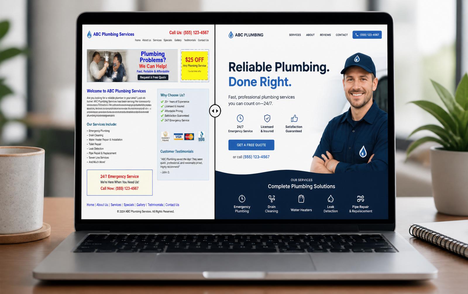
A business owner scrolls through their analytics dashboard and sees something discouraging: thousands of visitors last month, almost no leads, and even fewer sales. The site looks great — sharp photography, on-brand colors, smooth animations. So why isn't it working?
This is one of the most common — and most expensive — misunderstandings in small business marketing: a beautiful website and a high-converting website are not the same thing. One is designed to be admired. The other is engineered to turn a stranger into a customer. If your website only does the first job, it's costing you money every day it stays live.
At JadeMediaPro, we've rebuilt this exact story for dozens of clients — swapping "pretty but passive" for "polished and profitable." This guide breaks down what conversion-focused design actually means, why it matters more than ever in 2026, and how to evaluate whether your own website is pulling its weight.
What "High-Converting" Actually Means
A conversion is any action you want a visitor to take: booking a consultation, requesting a quote, completing a purchase, downloading a resource, or signing up for a newsletter. A high-converting website is simply one that gets a meaningfully higher percentage of visitors to complete that action than the average site in its industry.
Recent industry data puts the global average website conversion rate at roughly 2.35% to 3.1%, meaning the typical site loses 97 out of every 100 visitors without a single meaningful action taken. Dedicated landing pages perform far better — often around 4% on average, with top-quartile pages exceeding 11%. For a business generating 10,000 monthly visitors, moving from a 2% to a 4% conversion rate can mean an extra 200 leads a month — without spending a single additional dollar on traffic.
Conversions look different for every business
- E-commerce brands care about completed purchases and average order value.
- Professional service firms (law, accounting, consulting) care about booked consultations.
- Nonprofits care about completed donations or volunteer sign-ups.
- B2B companies care about qualified demo requests or gated content downloads.
A high-converting website isn't built around a generic checklist. It's built around your specific customer journey and your specific desired outcome.
Why Beautiful Design Alone Falls Short
Aesthetics build first impressions — and first impressions matter enormously. Users form an opinion about a site within seconds, and that opinion shapes whether they stay or bounce. But aesthetics only earn you the visitor's attention. They don't tell the visitor what to do next, why they should trust you, or why they should act now instead of "later" (which, statistically, means never).
Think of a stunning website with no clear direction as a beautifully designed store with no signage, no price tags, and no cashier in sight. Visitors admire the shelves and walk out empty-handed.
The cost of a "pretty but passive" website
- Wasted ad spend. Every dollar spent on SEO, paid ads or social campaigns landing on a low-converting page is diluted.
- Lost trust signals. Visitors who can't quickly find proof of credibility assume there isn't any.
- Missed urgency. Without clear calls-to-action, even interested visitors drift away and forget to come back.
- Compounding opportunity cost. Every month a low-converting site stays live, competitors with sharper digital experiences capture the customers you should have won.
The Anatomy of a High-Converting Website
Every high-performing website — regardless of industry — shares a set of structural fundamentals.
1. A clear value proposition above the fold
Within three seconds, a visitor should be able to answer: What does this business do, who is it for, and why should I care? If your headline is vague or clever at the expense of clarity, you're losing visitors before they scroll.
2. One primary call-to-action per page
Pages that ask visitors to do five different things dilute focus and reduce conversions. The best-performing pages guide visitors toward a single next step, with secondary actions clearly de-emphasized.
3. Trust signals placed strategically
Testimonials, client logos, certifications, review scores, and case study results should appear near your primary CTA — not buried on a separate "About" page. Trust signals answer the objection a visitor is silently raising right before they decide whether to convert.
4. Frictionless forms
Every additional form field reduces completion rates. Benchmark data shows that short three-field forms convert at roughly 10%, while nine-field forms drop to around 3.6%. If you don't need the information immediately, don't ask for it on the first touch.
5. Fast, mobile-first performance
Mobile traffic is the majority of visits for most small businesses, yet mobile conversion rates still trail desktop — largely due to page speed and checkout friction. A conversion-focused site is engineered mobile-first, not mobile-adapted as an afterthought.
A quick self-check
- Can a first-time visitor explain what you do within five seconds of landing on your homepage?
- Is there a single, obvious next step on every page?
- Would a skeptical stranger find evidence of your credibility without leaving the page?
- Does your site load in under three seconds on mobile?
If you answered "no" or "not sure" to any of these, your website likely has untapped conversion potential.
The Psychology Behind Conversion Design
Great conversion design isn't about tricks — it's about respecting how people actually make decisions online.
Reducing cognitive load
The human brain avoids unnecessary effort. Cluttered layouts, competing visual elements, and unclear navigation all increase the mental "cost" of using your site, and visitors abandon that cost by leaving. Clean, hierarchical design reduces friction and keeps visitors moving toward a decision.
Social proof and reciprocity
People look to others for cues on how to behave, especially when uncertain. A testimonial, a "join 4,000+ customers" statistic, or a visible star rating reduces perceived risk. Offering something valuable upfront — a free guide, a helpful calculator, a no-obligation quote — triggers a sense of reciprocity that makes visitors more receptive to your ask.
Urgency without manipulation
Genuine urgency (limited appointment slots, seasonal offers, application deadlines) motivates action. The key distinction between ethical and manipulative urgency is authenticity — visitors can sense the difference, and fake countdown timers erode trust faster than they build conversions.
Common Website Mistakes That Kill Conversions
- Slow load times. Every additional second of load time increases bounce rate.
- Vague navigation. If visitors can't find pricing, services, or contact within two clicks, they leave.
- No mobile optimization. With most traffic now mobile, a desktop-first site is a liability.
- Stock photography overload. Generic imagery undermines authenticity — real photos of your team, workspace or product outperform stock every time.
- Missing or buried contact information. Ready-to-convert visitors shouldn't hunt for a phone number.
- Outdated content. A blog with no posts since 2022 signals neglect.
- No analytics tracking. Without conversion tracking in place, you're optimizing blind.
How to Audit Your Own Website's Conversion Potential
- Time yourself. Land on your homepage as a stranger would. How long does it take to understand what you offer?
- Check your funnel. Walk through the exact path a customer takes from homepage to conversion. Count the clicks. Count the form fields.
- Test on mobile. Open your site on your phone using cellular data. Does it load quickly? Is text readable without zooming?
- Review your analytics. Look at bounce rate, session duration, and conversion rate by page. Fix your highest-traffic, lowest-converting pages first.
- Ask a stranger. Have someone outside your business attempt to complete your primary conversion goal while you watch silently. Where do they hesitate?
Mobile, Speed, and the Non-Negotiables of 2026
Two factors now separate high-converting sites from the rest more than any design trend: speed and mobile experience.
Speed is a revenue metric, not a technical one
Search engines factor page experience into rankings, and visitors abandon slow pages before they ever see your offer. Treat page speed as a business KPI, reviewed alongside conversion rate and traffic.
Mobile is the default experience
Design and test for mobile first, then adapt up to desktop. Tap-friendly buttons, condensed forms, simplified navigation that doesn't require pinch-zooming.
AI search is reshaping the traffic mix
Traffic arriving from AI-powered search tools like ChatGPT and Perplexity now converts noticeably higher than traditional organic search in early benchmark data — users arrive having already narrowed their options. A high-converting website needs clear, well-structured content these AI tools can accurately summarize and cite.
How JadeMediaPro Builds Websites That Convert
Every website we design starts with strategy, not templates. Our process combines:
- Business Strategy sessions to define your ideal customer and primary conversion goals
- Branding alignment so your site reflects a consistent, trustworthy identity
- UX-first Web and App Development, engineered for speed, clarity, and mobile performance
- Conversion-focused copywriting that speaks directly to your customer's needs and objections
- Ongoing Digital Marketing support to keep driving qualified traffic to a site that's built to convert it
We don't hand off a finished website and disappear. We treat conversion rate as an ongoing metric worth improving quarter over quarter.
Ready to Turn Your Website Into a Growth Engine?
Your website should be your hardest-working employee — available 24/7, consistently representing your brand, and actively turning visitors into customers. If it isn't doing that today, the fix is closer than you think.
Frequently Asked Questions
What is a good website conversion rate for a small business?
Most industries see average conversion rates between 2% and 5%, with anything above roughly 3.5% considered strong. Purpose-built landing pages typically perform higher, often reaching 4% or more.
How long does it take to redesign a website for conversions?
A focused conversion-oriented redesign typically takes four to eight weeks, depending on the size of the site and the amount of new content, photography or copywriting required.
Do I need to rebuild my entire website to improve conversions?
Many businesses see meaningful gains from targeted changes — improving the homepage headline, simplifying forms, adding trust signals — before committing to a full rebuild.
Does website design actually affect SEO rankings?
Yes. Page speed, mobile usability, and structured, easy-to-navigate content are all factors search engines weigh, meaning conversion-focused design and SEO performance are closely linked.
Can I improve conversions without changing my website's visual design?
Often, yes. Copy clarity, CTA placement, form length and page speed can all be improved without a full visual overhaul, though a broader refresh usually compounds the results.
What's the difference between a landing page and a homepage for conversions?
A landing page is built around a single offer and a single action, which is why landing pages typically convert at nearly double the rate of general homepage traffic.
Ready to take the next step?
Our team is ready to help you put these ideas to work.
Get a Free Website Conversion Audit